 |
Chapter 8The Look of the Show | |
In movies a plays there is often great thought put into the design of a production. The production designer will even consider the psychological and subliminal effects that the audience will never even be aware of. In any great production there is so much more communication being given to the audience that's not written in the dialogue. The shapes and colors used in a production are no exception.
Color

In movies and plays color is considered very carefully, because it has a powerful effect on the way people feel. Different colors create different feel ing and the relationships between colors also play a role.
Hot and Cold


How do you feel when you think of colors like blue and purple? What are the first things you think of that are blue? Many people would say the sky or water. Those are considered the cool colors. They make us think of cool temperatures, but they are also associated with cool emotions. The cool colors are like the yin in yin and yang. They can bring about both good and bad emotions. They can make you feel relaxed, but they can also make you sad. They feel very different from the warm colors. How do red, orange and yellow make you feel? What do they make you think of? These are the warm colors. They are like the yang in yin and yang. They are full of vibrant energy. They can make you feel comfortably warm, but they can also be associated with fear and anger. They can bring about both good and bad emotions. They are full of warm energy. Then there's green. When we think of green we often think of plants and trees. Green is considered a neutral color. It is very common, especially in animation, to use colors that bring about the desired mood. Just as background music can help tell how a character is feeling, color can do the same. You can consider whether you want your scene to be very cool or to be very warm.
The Color WheelThe best resource for understanding the relationship between colors is to use the color wheel. You can see that colors which are close to each other on the wheel are somewhat similar and can gently blend together. Colors that are across from each other are very different. So the colors that are next to each other are considered neighbors. They can easily be used together. The colors opposite each other also work well together. They are called complimentary colors. Whether you stick with neighboring colors or put complimentary colors together can have a very effect. Neighbors will easily blend into each other, while complimentary colors will help each other stand out. |  |
Saturation


Saturation is the strength of the color. If a color is very saturated than it is a very strong red or green. Colors that are not very saturated are things like brown, grey and tan. A theatre designer or a movie production designer will often consider how saturated colors should be in order to give the right mood. It is probably very easy for you to think of what a difference it makes. desaturated colors can feel more sophisticated, sensible and conservative or they can also feel very drab and depressing. Saturated colors can feel more playful, exciting and magical and also very strange and wild.
Coloring a Story
As mentioned earlier, color can set the mood of the scene, but also specific choices for elements within the story can have a great impact. There are several tricks movie and theatre designers will use to effect how the audience feels about the story by using colors. One method is to associate certain colors with certain characters or groups in the story. What color or kinds of colors fit with the hero versus the villain or the other characters in the story. You can then use colors to contrast different characters, places, or groups. If you want a character to seem wild or eccentric in a world of normal people, you could put that charter in saturated colors while the other characters are in desaturated colors. In the 1971 version of Willie Wonka and the Chocolate Factory Willie Wonka stands out from the other adults by wearing very bright colors.

It is very common for designers to put a lead character in something different that makes them stand out from the crowd. Another common technique in fantasy films that is illustrated in the movie Willie Wonka and the Chocolate Factory is to keep the colors desaturated in the normal world and then bring in the saturated colors when the characters enter the magical world. This was done in an extreme way in The Wizard of Oz. The film starts off in black and white and then suddenly turns to color when Dorothy enters the land of Oz.
Another technique used in films and plays is to deprive and indulge. Consider a story where the hero is missing his love interest. You can help make the audience miss a character or an element in the story, but also having them miss the colors associated. So if the hero is in love with someone who wears green, keep green out of the scene when that character is being missed. Also, consider this common factor. See lots of a certain color usually makes people desire seeing its compliment. So if you want to miss the character who wears green, fill the scene with lots of red.
Location as Costume
As mentioned above, characters often have colors that are associated with them. Those colors will often be seen in their costume, but can also be part of the set that belongs to them. You see, in a way, you can think about a set as an extension of costume. Places often belong to a character. Consider when you enter a house. Even if you have never met the person who lives there, the house will tell you things about their personality.


The set is a great opportunity to describe your character without dialogue. Often it is more interesting to describe a character in directly. That is why it is so common in movies to see the place that a strange character lives before we meet the strange character. It is less common in plays because it is a lot more difficult to explore a setting the way they do in movies.
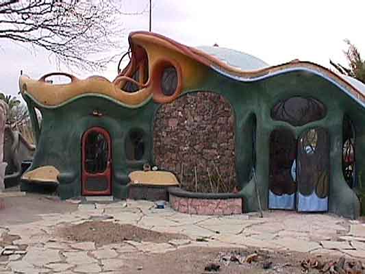
Shapes and Lines
This section is a lot shorter because the ideas that apply to color also apply to shapes and lines. Also consider what shapes and lines best describe your characters and places.
Jagged EdgesJagged lines are sharp. The make us think of knives and blades. They feel rough and dangerous. |  |
 | Wavy LinesWavy lines are more playful. We associate them with strange, magical and eccentric characters. |
Straight LinesStraight lines with 90 degree angles are more common in cities. We associate them with conservative characters, or modern mechanical places. | 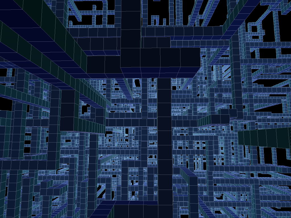 |
 | Squares and RectanglesSquares feel very modern and efficient. They can also feel very conservative and ridig |
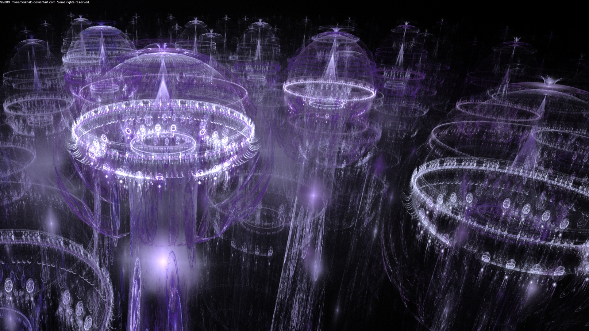 | CirclesCircles feel more natural. They can make us feel peaceful and in balance. We also find lots of circles in fun places like theme parks. |
TrianglesTriangles can feel much more spiritual and magical. |  |
No comments:
Post a Comment